
Diagrams in UPSC Mains Answers can improve clarity when they show processes, relationships and comparisons without repeating the written content.

Diagrams in UPSC Mains Answers
Aspirants often assume that a diagram improves an answer because it looks different from a paragraph. That is not how evaluation works. A diagram earns space only when it reduces the evaluator’s effort and reveals something that prose would take longer to explain.
In strong answers, diagrams are reasoning devices.
Consider a question on urban flooding. A weak answer writes five causes in prose and then repeats them inside bubbles. Nothing has been added. A stronger answer uses a flowchart to show the chain: wetland encroachment, concretisation, blocked drainage and intense rainfall leading to rapid runoff, waterlogging, infrastructure failure, disease and economic loss. The diagram does not merely list causes; it explains how the crisis develops.
Before drawing, ask: does the visual show a process, relationship, hierarchy, feedback loop, comparison, spatial pattern or stakeholder conflict? If not, it is probably unnecessary.
A Diagram Must Emerge From the Argument
Do not begin an answer by deciding that you will insert a flowchart. First identify the core argument.
Suppose the question asks why Urban Local Bodies remain weak despite constitutional recognition. The argument is not that municipalities face several problems. The deeper argument is that constitutional status has not produced operational autonomy.
Now a diagram becomes useful:
Incomplete devolution of functions, functionaries and funds → dependence on state governments → weak planning capacity → poor service delivery → diluted accountability.
This flowchart connects the 74th Constitutional Amendment, municipal finance, staffing shortages and administrative dependence into one institutional chain.
In GS Paper I, a cycle can explain how land degradation, falling productivity, rural distress and migration reinforce one another.
In GS Paper II, a hub-and-spoke diagram can map the actors involved in welfare delivery: Union government, state government, district administration, local bodies, frontline workers, civil society and beneficiaries.
In GS Paper III, a value-chain diagram can show where agricultural income is lost between input purchase, production, storage, transport, processing and retail.
In GS Paper IV, a stakeholder map can clarify why an administrative decision creates competing claims of legality, compassion, public safety, livelihood and fairness.
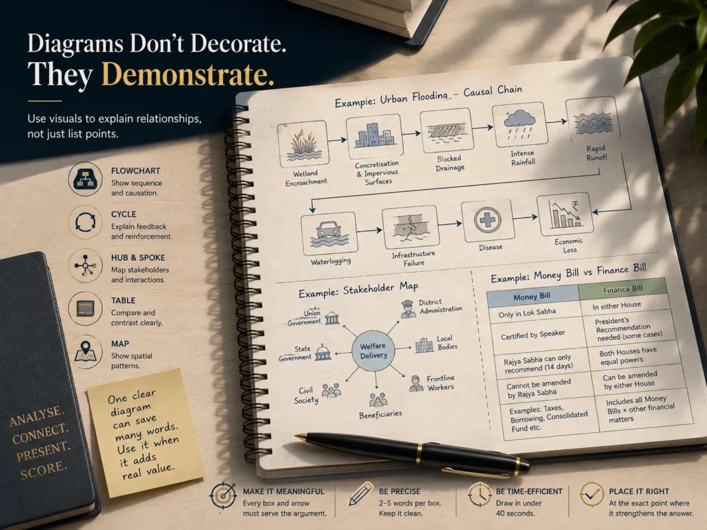
The form must follow the relationship. Use a flowchart for sequence, cycle for reinforcement, table for comparison, map for location, pyramid for hierarchy and hub-and-spoke diagram for multiple actors.
Most Diagrams Fail for Three Reasons
The first problem is duplication. Aspirants write a paragraph and then redraw the same information. A diagram should replace part of the explanation, not repeat it.
The second problem is abstraction. Boxes such as “better governance,” “awareness,” “technology” and “public participation” appear impressive but explain little. Replace “better governance” with activity mapping, predictable transfers, local data systems or social audits.
The third problem is poor placement. A diagram should appear exactly where the relationship is discussed. A stakeholder map belongs near the stakeholder analysis, not randomly at the end. A reform flowchart belongs in the way forward, not before the problem is established.

One good diagram is enough in a ten-mark answer. A fifteen-mark answer may use two only when both serve different purposes. More visuals do not automatically mean better presentation. They can fragment the argument and reduce space for evidence.
Keep the drawing compact. Two to five words inside each box are enough. Use arrows consistently. Label maps. Avoid decorative icons, excessive shading and complicated geometry. If a diagram takes more than forty seconds, it is too elaborate under actual examination time pressure and needs simplification.
UPSC Civil Services (Main) Examination 2026
Build a Visual Bank, But Do Not Memorise Finished Diagrams
Aspirants should prepare reusable visual structures, not fixed drawings.
Maintain adaptable frameworks for institutional decline, policy implementation, disaster management, ethical decision-making, social exclusion, climate vulnerability, agricultural value chains and federal relations. The structure can remain familiar, but the content must change according to the question.
A practical exercise is to take five PYQs each week and identify one paragraph in each answer that can be converted into a visual. Draw it, then test it on four questions:
Does it show a relationship?
Does it save words?
Does it directly answer the demand?
Can it be drawn clearly in under forty seconds?
If the answer to any two is no, remove it.
UnderStand UPSC’s Mains Answer Writing Practice can be used for this exercise. Attempt the answer first, add the visual only after identifying the central argument, and then compare whether the page has become clearer or merely more crowded.
The mature use of diagrams is restrained. They are not evidence of creativity by themselves. Their value lies in making causation, interaction and structure immediately visible.
A strong diagram tells the evaluator, within seconds, that the aspirant understands not only the components of an issue, but also how those components connect. That is where presentation becomes analysis, and where a visual begins to justify the space it occupies.
FAQs
1. How can diagrams improve UPSC Mains answers?
Diagrams can improve clarity by showing processes, relationships, hierarchies, feedback loops, comparisons or spatial patterns more efficiently than lengthy prose. They should add analysis rather than simply repeat the written answer.
2. When should UPSC aspirants use diagrams and flowcharts in Mains answers?
Aspirants should use a diagram when it directly explains the question’s demand and communicates a relationship or process more clearly than words. A visual is unnecessary if it only duplicates the paragraph.
3. Which types of diagrams are useful in UPSC Mains?
Flowcharts are useful for sequences and processes, cycles for feedback relationships, tables for comparisons, maps for spatial patterns, pyramids for hierarchies and hub-and-spoke diagrams for multiple stakeholders.
4. How many diagrams should be used in a UPSC Mains answer?
One relevant diagram is generally enough for a 10-mark answer. A 15-mark answer may use two diagrams when they serve different purposes. The focus should remain on relevance and clarity rather than the number of visuals.
5. How can I practise diagrams for UPSC Mains answer writing?
Take five UPSC Mains PYQs each week and identify one paragraph that could be converted into a visual. Practise drawing it clearly in under 40 seconds, then check whether it shows a relationship, saves words and directly answers the question.